
2026 Cloud Phone Desktop Organization Tips: App Grouping and Shortcuts That Boost Efficiency
Why a Cloud Phone Home Screen Always Ends Up Messy
The best thing about a cloud phone is that it doesn't eat up local storage, so installing apps costs you nothing. But that is exactly why, after a few months of use, many home screens turn into a junk drawer: twenty apps installed, three multi-instance sessions running, icons spreading from the first page to the fourth, and finding a customer-service tool means swiping and guessing.
The root cause is rarely too many apps. It is that the organizing logic hasn't kept up with your actual habits. Three patterns account for most of the mess:
The first is sorting by install date. Newly installed apps always land at the end, and the longer you use the device, the deeper your most valuable tools sink.
The second is mixing daily drivers with occasional tools. Something you tap twenty times a day sits next to something you open once a month, and the two visually interfere with each other.
The third is folders that only store, never organize. Names like Tools, Other, or To Sort mean you still have to hunt again after opening them.
The five steps below dismantle each of those three patterns.
Step One: Group by Usage Scenario, Not Install Date
The single most effective move is to classify apps by what you actually do inside the cloud phone, not by app-store category. In a cloud phone you usually open an app to complete a task: run a store, edit a short video, keep a game session alive.
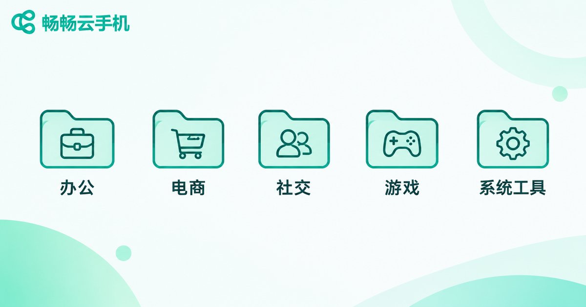
Start with five stable groups. They cover most cloud phone workflows:
Office and collaboration: documents, meetings, email, notes.
E-commerce operations: store backends, customer service tools, dashboards.
Social and content: short-video platforms, publishing apps, editing and assets.
Game sessions: the games themselves plus helper tools.
System utilities: file manager, settings, backup and cleanup.
| Organizing method | Average time to find an app | Long-term maintainability | Best for |
|---|---|---|---|
| Sorted by install date | Two to three screen swipes | Poor, degrades over time | Fewer than 10 apps |
| Sorted by app-store category | Requires recalling the category | Fair, easy to misfile | Light usage |
| Grouped by usage scenario | Usually one tap | Good, new apps have a home | Multi-instance, multi-task cloud phones |
The key rule is that each app belongs to exactly one group. If you feel an app could go anywhere, that usually means you rarely open it, so let it settle into System Utilities.
Step Two: Move High-Frequency Actions to the First Screen
The first screen is the one you look at most, so it should serve only your most frequent tasks. A useful test: anything you open fewer than twice a week should not occupy an icon slot on the first screen.
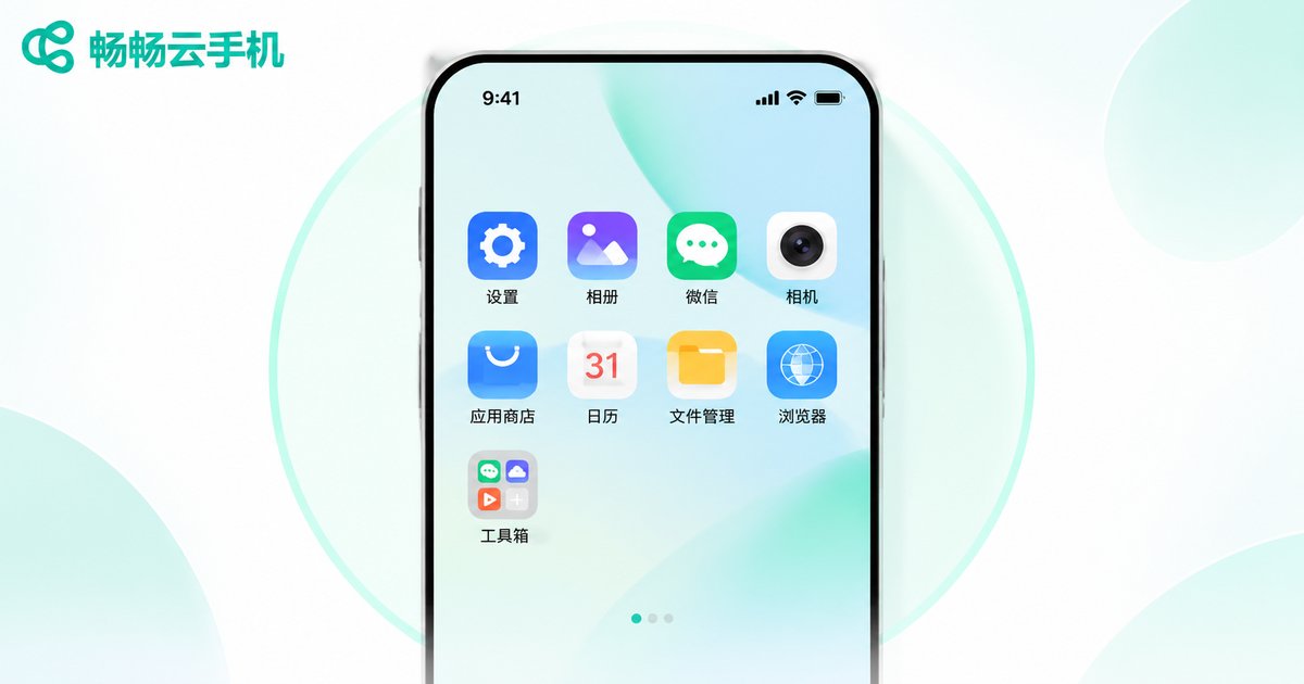
The recommended layout is no more than eight icons on the first screen, plus one folder entry. Two rows of four sit exactly in the area your thumb reaches naturally, with no hand switching and no stretching.
Here is one way to allocate those eight slots:
Top-left: the one app you open every day, usually your main work tool.
Middle two columns: the three or four apps tied to today's tasks.
Bottom-right: whatever you return to most, such as the file manager or a message list.
The last slot: an All Apps folder as a fallback entry point.
Every other group moves to the second screen as folders. The result is that your daily path is only one level deep: no thinking, just tapping. Low-frequency apps are still there, they simply stop competing for attention.
Step Three: Set Folder Naming and Ordering Rules
Most folders fail because their names are empty. Rename Tools to Ecom · Support and Other to System · Cleanup, and you know what is inside before you open it. That is the whole point of a folder.
A simple naming formula works well: scenario word + separator + purpose word, for example Office · Docs, Content · Editing, Games · Helpers. Keep names to four to six characters so they display fully under the icon.
Order inside the folder matters too:
Cap the count: no more than nine apps per folder, so one screen covers it without a second swipe.
Order by frequency: most used at the top-left, always.
Keep silhouettes consistent: apps of the same type should look similar at a glance.
Prune regularly: anything untouched for a month moves out to System Utilities.
It sounds fussy, but it takes about ten minutes once. After that, every new install has an obvious home and the screen never drifts back into chaos.
Step Four: Use Shortcuts to Cut Down on Taps
Desktop organization solves finding things. Shortcuts solve tapping fewer times. A few techniques can compress a four-step action into one.
Long-press an icon for its quick menu. Most apps expose direct entries for common functions such as new note, scan, or quick search. Using those entries is roughly twice as fast as opening the app and hunting for the menu.
Replace opening an app with a widget. Dashboards, to-do lists, clocks and sticky notes can live right on the home screen, so a glance is enough. Keep widgets to two at most and place them in the lower half of the first screen so they don't steal icon slots.
Treat search as your primary entry point. Past roughly thirty apps, the fastest way to find something is often not grouping but pulling down or double-tapping the blank area and typing two characters. Groups keep things visually clear; search keeps things fast.
Use the floating navigation. A floating back, home and screenshot control saves you from repeatedly reaching to the bottom edge, which is especially noticeable in landscape mode.
Step Five: A Five-Minute Weekly Maintenance Checklist
Organization is not a one-off project, it is a very small habit. Spend five minutes each week on this checklist and the screen stays clean long term:
Delete: uninstall or archive anything you haven't opened in thirty days.
Move: promote apps you reached for often this week but that weren't on the first screen.
Merge: keep only one of any duplicated function, such as two similar cleanup tools.
Clean: clear cache and temporary files so the instance doesn't slow down.
Back up: note or export your current layout so you can restore it quickly on another instance.
All five steps together usually take under five minutes, and they prevent the once-every-six-months full rebuild.
On ccloudphone, Organizing Takes One Less Step

Everything above works on any cloud phone. If yours runs on ccloudphone, a few characteristics make the work lighter.
Your layout follows your account. Because apps and the system run in the cloud, groups, folders and icon order are stored there too. Log in on another device and your organized screen is exactly as you left it, with no need to rebuild it on every local device.
Each multi-instance session has its own independent desktop. E-commerce operators often run one instance per storefront, and content creators one per account. Independent desktops mean you can give each instance a completely different grouping scheme: instance A puts backends and dashboards on the first screen, instance B puts customer service and the asset library there, with no cross-contamination between accounts.
No local storage cost, so your phone stays clean. Apps live inside the cloud instance while the local device only handles display and input. You can install a full toolset in the cloud phone while your local home screen keeps just the handful of everyday apps.
Always online, so the desktop is a permanent workbench. Cloud phones keep running in the cloud, so once you have shaped the layout into a fixed workflow, every session opens to the same arrangement and you skip the warm-up.
In other words, the value of desktop organization is amplified on a cloud phone: you tidy once, and the payoff lasts for the entire usage cycle.
Frequently Asked Questions
Q: If I have too many apps, should I just drop them all into one folder?
Not recommended. Putting everything in one folder isn't classification, it just changes hunting by swipe into hunting inside a folder. Start with three to five scenario groups and move low-frequency apps into System Utilities.
Q: How many icons should the first screen hold?
Eight icons plus one folder entry is a comfortable ceiling. Beyond that, icons move into areas your thumb must stretch for, and the screen tends to go messy again.
Q: Should I group by app type or by usage scenario?
By usage scenario. In a cloud phone you open apps to complete a task, so scenario grouping keeps all the apps for one task together and reduces back-and-forth switching.
Q: Do I need to organize every multi-instance session separately?
Each session needs its own layout, but not its own thinking. Define one shared template (office, e-commerce, content, games, system), then adjust only the eight first-screen slots per instance.
Q: What if it gets messy again after a while?
Make maintenance a fixed five-minute weekly ritual: remove apps untouched for thirty days, promote this week's frequent apps to the first screen, merge duplicates, and clear the cache. Small upkeep beats an annual purge.
Q: Does desktop organization affect cloud phone performance?
Organization itself doesn't boost performance, but sensible grouping reduces the number of apps kept resident, which indirectly helps the instance run smoother. What really affects smoothness is instance configuration and cache usage, so clear temporary files regularly.